#SWDchallenge: Graph makeover

At storytelling with data, they run a monthly challenge on data visualization named #SWDchallenge. The main idea of the challenges is to test data visualization and storytelling skills.

Each month the challenge has a different topic. This month the challenge was to improve an existing graph. I decided to take a previous graph of mine that was published on a paper that was published on 2015.

The "original"

The following is the graph that we are going to start with.

Original plot

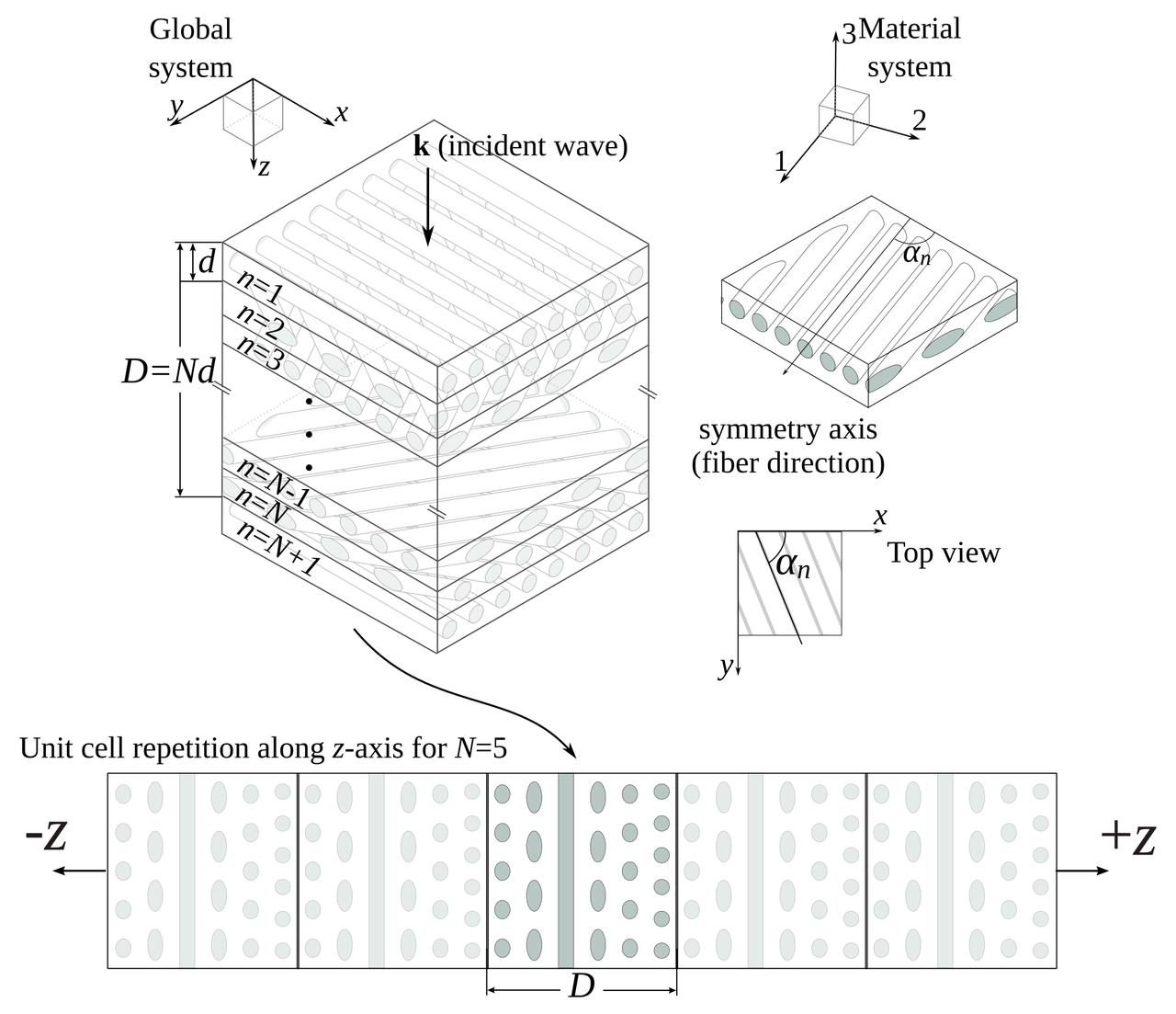
This is not the exact same graph that was presented in the article on 2015, but it serves the purpose of the challenge. The data can be downloaded from here. This graph present the fraction of energy (\(\eta\)) transmitted for helical composites with different geometrical parameters. The parameters varied were:

  • Pitch angle \(\alpha\): the angle between consecutive layers;

  • Composite thickness \(D\), that is normalized to the wavelength \(\lambda\); and

  • Number of layers \(N\) in each cell of the composite.

The following schematic illustrate these parameters.

Composites

I would not say that the graph is awful, and, in comparison to what you would find in most scientific literature it is even good. But … in the land of the blind, the one-eyed is king. So, let's enumerate what are the sins of the plot and see if we can correct them:

  • It has two x axes.

  • The legend is enclosed in a box that seems unnecessary.

  • Right and top spines are not contributing to the plot.

  • Annotations are stealing protagonism from the data.

  • It looks clutterd with lines and markers.

  • It is a spaghetti graph.

The following snippet generates this graph.

import numpy as np
from matplotlib import pyplot as plt
from matplotlib import rcParams

rcParams['font.family'] = 'serif'
rcParams['font.size'] = 16
rcParams['legend.fontsize'] = 15
rcParams['mathtext.fontset'] = 'cm'

markers = ['o', '^', 'v', 's', '<', '>', 'd', '*', 'x', 'D', '+', 'H']
data = np.loadtxt("Energy_vs_D.csv", skiprows=1, delimiter=",")
labels = np.loadtxt("Energy_vs_D.csv", skiprows=0, delimiter=",",
                    usecols=range(1, 9))
labels = labels[0, :]

fig = plt.figure()
ax = plt.subplot(111)
for cont in range(8):
    plt.plot(data[:, 0], data[:, cont + 1], marker=markers[cont],
             label=r"$D/\lambda={:.3g}$".format(labels[cont]))

# First x-axis
xticks, xlabels = plt.xticks()
plt.xlabel(r"Number of layers - $N$", size=15)
plt.ylabel(r"Fraction of Energy - $\eta$", size=15)
ax.legend(loc='center left', bbox_to_anchor=(1, 0.5))

# Second x-axis
ax2 = ax.twiny()
ax2.set_xticks(xticks[2:])
ax2.set_xticklabels(180./xticks[2:])
plt.xlabel(r"Angle - $\alpha\ (^\circ)$", size=15)

plt.tight_layout()
plt.savefig("energy_vs_D_orig.svg")
plt.savefig("energy_vs_D_orig.png", dpi=300)

Corrections

I will vindicate the graph one sin at a time, let's see how it turns out.

It has two x axes

I, originally, added two axes to show both the number of layers and the angle between them at the same time. The general recommendation is to avoid this, so let's get rid of the top one.

First iteration

Legend in a box

Pretty straightforward …

Second iteration

Right and top spines

Let's remove them

Third iteration

Annotations are stealing protagonism

Let's move all the annotations to the background by changing the color to a lighter gray.

Fourth iteration

Clutterd with lines and markers

Let's just keep the lines.

Fifth iteration

And increase the linewidth.

Sixth iteration

It is a spaghetti graph

I think that a good option for this graph would be to highlight one line at a time. Doing this, we end up with.

Seventh iteration

The following snippet generates this version.

import numpy as np
from matplotlib import pyplot as plt
from matplotlib import rcParams

# Plots setup
gray = '#757575'
plt.rcParams["mathtext.fontset"] = "cm"
plt.rcParams["text.color"] = gray
plt.rcParams["xtick.color"] = gray
plt.rcParams["ytick.color"] = gray
plt.rcParams["axes.labelcolor"] = gray
plt.rcParams["axes.edgecolor"] = gray
plt.rcParams["axes.spines.right"] = False
plt.rcParams["axes.spines.top"] = False
rcParams['font.family'] = 'serif'
rcParams['mathtext.fontset'] = 'cm'


def line_plots(data, highlight_line, title):
    plt.title(title)
    for cont, datum in enumerate(data[:, 1:].T):
        if cont == highlight_line:
            plt.plot(data[:, 0], datum, zorder=3, color="#984ea3",
                     linewidth=2)
        else:
            plt.plot(data[:, 0], datum, zorder=2, color=gray,
                     linewidth=1, alpha=0.5)


data = np.loadtxt("Energy_vs_D.csv", skiprows=1, delimiter=",")
labels = np.loadtxt("Energy_vs_D.csv", skiprows=0, delimiter=",",
                    usecols=range(1, 9))
labels = labels[0, :]

plt.close("all")
plt.figure(figsize=(8, 4))
for cont in range(8):
    ax = plt.subplot(2, 4, cont + 1)
    title = r"$D/\lambda={:.3g}$".format(labels[cont])
    line_plots(data, cont, title)
    plt.ylim(0.4, 1.0)
    if cont < 4:
        plt.xlabel("")
        ax.xaxis.set_ticks([])
        ax.spines["bottom"].set_color("none")
    else:
        plt.xlabel(r"Number of layers - $N$")
    if cont % 4 > 0:
        ax.yaxis.set_ticks([])
        ax.spines["left"].set_color("none")
    else:
        plt.ylabel(r"Fraction of Energy - $\eta$")


plt.tight_layout()
plt.savefig("energy_vs_D_7.svg")
plt.savefig("energy_vs_D_7.png", dpi=300)

Final tweaks

Using Inkscape I added some final details to get the following version.

Final

Further reading

Isometric graphics in Inkscape: Part 2

Last week I posted a quick guide on isometric drawing using Inkscape. In that post, I showed how to obtain images that are projected to the faces of an isometric box.

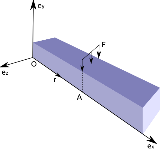
After my post, I was asked by Biswajit Banerjee on Twitter if I could repeat the process with a more complex example, and he suggested the following schematic

Computing the moment of force in a beam

which, I guess, was created in Inkscape using the "Create 3D Box" option.

In this post, I will:

  1. Use the same approach from last week to recreate this schematic

  2. Suggest my preferred approach for drawing this schematic

First approach

I will repeat the cheatsheet from last week. Keep in mind that Inkscape treats clockwise rotation as positive. Opposite to common notation in mathematics.

Cheatsheet for isometric schematics in Inkscape

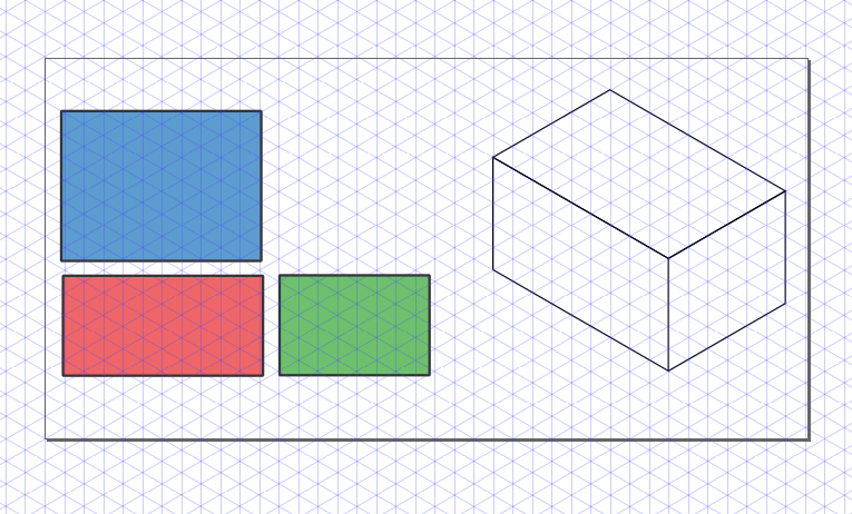
Then, to create a box with desired dimensions we first create each rectangle with the right dimensiones (in parallel projections). In the following example we used faces with aspect ratios 3:2, 2:1 and 4:3. The box at the right is the figure obtained after applying the transformations described in the previous schematic.

Orthogonal views and final isometric figure

We can now proceed, to recreate the desired figure. I don't know the exact dimensions of the box; my guess is that the cross-section was a square and the aspect ratio was 5:1. After applying the transformations to each rectangle we obtain the following (adding some tweaks here and there).

Recreated figure using the described approach

Second approach

For this type of schematic, I would prefer to create an axonometric grid (File > Document Properties > Grids). After adding the grid to our canvas it is pretty straightforward to draw the figures in isometric view. The canvas should look similar to the following image.

Second approach: using an axonometric grid

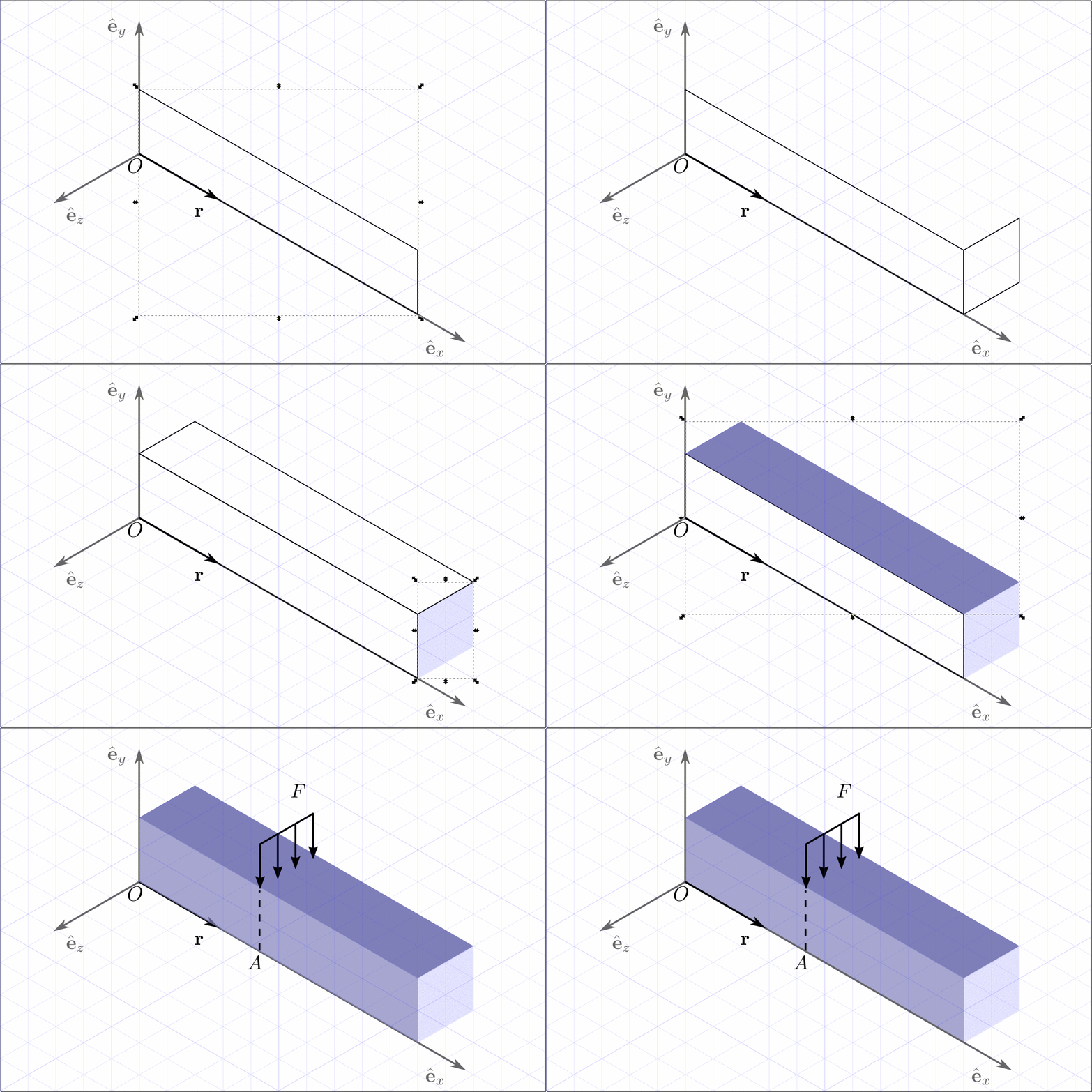
We can then draw each face using the grid. If we want to be more precise we can activate Snap to Cusp Nodes. The following animation shows the step by step construction.

Step by step construction of the isometric

And we obtain the final image.

Recreated figure using the second approach

Conclusion

As I mentioned, Inkscape can be used for drawing simple figures in isometric projection. Nevertheless, I strongly suggest to use a CAD like FreeCAD for more complicated geometries.

Isometric graphics in Inkscape

Sometimes I find myself in need of making a schematic using an isometric projection. When the schematic is complicated the best shot is to use some CAD like FreeCAD, but sometimes it's just needed in simple diagrams. Another situation where this is a common needed is in video games, where "isometric art" and pixel art are pretty common.

What we want is depicted in the following figure.

Views names in third angle representation

That is, we want to start with some information that is drawn, or written in the case of the example, and we want to obtain how would it been seen on one of the faces of an isometric box.

Following, I will describe briefly the transformations involved in this process. If you are just interested in the recipe for doing this in Inkscape, skip to the end of this post.

Transformations involved

Since we are working on a computer screen, we are talking of 2 dimensions. Hence, all transformations are represented by 2×2 matrices. In the particular example of interest in this post we need the following transformations:

  1. Vertical scaling

  2. Horizontal skew

  3. Rotation

Following are the transformation matrices.

Scaling in the vertical direction

The matrix is given by

\begin{equation*} M_\text{scaling} = \begin{bmatrix} 1 &0\\ 0 &a\end{bmatrix}\, , \end{equation*}

where \(a\) is the scaling factor.

Horizontal skew

The matrix is given by

\begin{equation*} M_\text{skew} = \begin{bmatrix} 1 &\tan a\\ 0 &1\end{bmatrix}\, , \end{equation*}

where \(a\) is the skewing angle.

Rotation

The matrix is given by

\begin{equation*} M_\text{rotation} = \begin{bmatrix} \cos a &-\sin a\\ \sin a &\cos a\end{bmatrix}\, , \end{equation*}

where \(a\) is the rotation angle.

Complete transformation

The complete transformation is given by

\begin{equation*} M_\text{complete} = M_\text{rotation} M_\text{skew} M_\text{scaling}\, , \end{equation*}

particularly,

\begin{align*} &M_\text{side} = \frac{1}{2}\begin{bmatrix} \sqrt{3} & 0\\ -1 &2\end{bmatrix}\approx \begin{bmatrix} 0.866 & 0.000\\ -0.500 &1.000\end{bmatrix}\, , \\ &M_\text{front} = \frac{1}{2}\begin{bmatrix} \sqrt{3} & 0\\ 1 &2\end{bmatrix}\approx \begin{bmatrix} 0.866 & 0.000\\ 0.500 &1.000\end{bmatrix}\, , \\ &M_\text{plant} = \frac{1}{2}\begin{bmatrix} \sqrt{3} & -\sqrt{3}\\ -1 &1\end{bmatrix}\approx \begin{bmatrix} 0.866 & -0.866\\ 0.500 &0.500\end{bmatrix}\, . \end{align*}

The values seem a bit arbitrary, but they can be obtained from the isometric projection itself. But that explanation would be a bit too long for this post.

Tranformation in Inkscape

We already have the transformation matrices and we can use them in Inkscape. But first, we need to understand how it works. Inkscape uses SVG, the web standard for vector graphics. Transformations in SVG are done using the following matrix

\begin{equation*} \begin{bmatrix} a &c &e\\ b &d &f\\ 0 &0 &1\end{bmatrix}\, , \end{equation*}

that uses homogeneous coordinates. So, one can just press Shift + Ctrl + M and type the components of the matrices obtained above for \(a\), \(b\), \(c\), and \(d\); leaving \(e\) and \(f\) as zero.

My preferred method, though, is to apply each transformation after the other in the Transform dialog (Shift + Ctrl + M). And, this is the method presented in the cheatsheet at the bottom of this post.

TL;DR

If you are just interested in the transformations needed in Inkscape you can check the cheatsheet below. It uses third-angle as presented below.

Views names in third angle representation

Cheatsheet

Keep in mind that Inkscape treats clockwise rotation as positive. Opposite to common notation in mathematics.

Cheatsheet for isometric schematics in Inkscape

Finite differences in infinite domains

Finite differences in infinite domains

Because of my friend, Edward Villegas, I ended up thinking about using a change of variables when solving an eigenvalue problem with finite difference.

The problem

Let's say that we want to solve a differential equation over an infinite domain. A common case is to solve the Time independent Schrödinger equation subject to a potential \(V(x)\). For example

\begin{equation*} -\frac{1}{2}\frac{\mathrm{d}^2}{\mathrm{d}x^2}\psi(x) + V(x) \psi(x) = E\psi(x),\quad \forall x\in (-\infty, \infty), \end{equation*}

where we want to find the pairs of eigenvalues/eigenfunctions \((E_n, \psi_n(x))\).

What I normally do when using finite differences is to regularly divide the domain. Where I take a large enough domain, so the solution have decayed close to zero. What I do in this post is to make a change of variable to render the interval finite first and then regularly divide the transformed domain in finite intervals.

My usual approach

My usual approach is to approach the second derivative with a centered difference for the point \(x_i\) like this

\begin{equation*} \frac{\mathrm{d}^2 f(x)}{\mathrm{d}x^2} \approx \frac{f(x + \Delta x) - 2 f(x_i) + f(x - \Delta x)}{\Delta x^2}\, , \end{equation*}

with \(\Delta x\) the separation between points.

We can solve this in Python with the following snippet:

import numpy as np
from scipy.sparse import diags
from scipy.sparse.linalg import eigs


def regular_FD(pot, npts=101, x_max=10, nvals=6):
    """
    Find eigenvalues/eigenfunctions for Schrodinger
    equation for the given potential `pot` using
    finite differences
    """
    x = np.linspace(-x_max, x_max, npts)
    dx = x[1] - x[0]
    D2 = diags([1, -2, 1], [-1, 0, 1], shape=(npts, npts))/dx**2
    V = diags(pot(x))
    H = -0.5*D2 + V
    vals, vecs = eigs(H, k=nvals, which="SM")
    return x, np.real(vals), vecs

Let's setup the plotting details.

# Jupyter notebook plotting setup & imports
%matplotlib notebook
import matplotlib.pyplot as plt

gray = '#757575'
plt.rcParams["figure.figsize"] = 6, 4
plt.rcParams["mathtext.fontset"] = "cm"
plt.rcParams["text.color"] = gray
fontsize = plt.rcParams["font.size"] = 12
plt.rcParams["xtick.color"] = gray
plt.rcParams["ytick.color"] = gray
plt.rcParams["axes.labelcolor"] = gray
plt.rcParams["axes.edgecolor"] = gray
plt.rcParams["axes.spines.right"] = False
plt.rcParams["axes.spines.top"] = False

Let's consider the Quantum harmonic oscillator, that has as eigenvalues

\begin{equation*} E_n = n + \frac{1}{2},\quad \forall n = 0, 1, 2 \cdots \end{equation*}

Using the finite difference method we have values that are really close to the analytic ones.

x, vals, vecs = regular_FD(lambda x: 0.5*x**2, npts=201)
vals

with output

array([0.4996873 , 1.49843574, 2.49593063, 3.49216962, 4.48715031,
       5.4808703 ])

With the analytic ones

[0.5, 1.5, 2.5, 3.5, 4.5, 5.5])

If we plot these two, we obtain the following.

plt.figure()
plt.plot(anal_vals)
plt.plot(vals, "o")
plt.xlabel(r"$n$", fontsize=16)
plt.ylabel(r"$E_n$", fontsize=16)
plt.legend(["Analytic", "Finite differences"])
plt.tight_layout();
Eigenvalues for the regular finite difference

Let's see the eigenfunctions.

plt.figure()
plt.plot(x, np.abs(vecs[:, :3])**2)
plt.xlim(-6, 6)
plt.xlabel(r"$x$", fontsize=16)
plt.ylabel(r"$|\psi_n(x)|^2$", fontsize=16)
plt.yticks([])
plt.tight_layout();
Eigenfunctions for the regular finite difference

One inconvenient with this method is the redundant sampling towards the extreme of the intervals, while under sample the middle part.

Changing the domain

Let's now consider the case where we transform the infinite domain to a finite one with a change of variable

\begin{equation*} \xi = \xi(x) \end{equation*}

with \(\xi \in (-1, 1)\). Two options for this transformation are:

  • \(\xi = \tanh x\); and

  • \(\xi = \frac{2}{\pi} \arctan x\).

Making this change of variable the equation we need to solve the following equation

\begin{equation*} -\frac{1}{2}\left(\frac{\mathrm{d}\xi}{\mathrm{d}x}\right)^2\frac{\mathrm{d}^2}{\mathrm{d}\xi^2}\psi(\xi) - \frac{1}{2}\frac{\mathrm{d}^2\xi}{\mathrm{d}x^2}\frac{\mathrm{d}}{\mathrm{d}\xi}\psi(\xi) + V(\xi) \psi(\xi) = E\psi(\xi) \end{equation*}

The following snippet solve the eigenproblem for the mapped domain:

def mapped_FD(pot, fun, dxdxi, dxdxi2, npts=101, nvals=6, xi_tol=1e-6):
    """
    Find eigenvalues/eigenfunctions for Schrodinger
    equation for the given potential `pot` using
    finite differences over a mapped domain on (-1, 1)
    """
    xi = np.linspace(-1 + xi_tol, 1 - xi_tol, npts)
    x = fun(xi)
    dxi = xi[1] - xi[0]
    D2 = diags([1, -2, 1], [-1, 0, 1], shape=(npts, npts))/dxi**2
    D1 = 0.5*diags([-1, 1], [-1, 1], shape=(npts, npts))/dxi
    V = diags(pot(x))
    fac1 = diags(dxdxi(xi)**2)
    fac2 = diags(dxdxi2(xi))
    H = -0.5*fac1.dot(D2) - 0.5*fac2.dot(D1) + V
    vals, vecs = eigs(H, k=nvals, which="SM")
    return x, np.real(vals), vecs

First transformation: \(\xi = \tanh(x)\)

Let's consider first the transformation

\begin{equation*} \xi = \tanh(x)\, . \end{equation*}

In this case

\begin{equation*} \frac{\mathrm{d}\xi}{\mathrm{d}x} = 1 - \tanh^2(x) = 1 - \xi^2\, , \end{equation*}

and

\begin{equation*} \frac{\mathrm{d}^2\xi}{\mathrm{d}x^2} = -2\tanh(x)[1 - \tanh^2(x)] = -2\xi[1 - \xi^2]\, . \end{equation*}

We need to define the functions

pot = lambda x: 0.5*x**2
fun = lambda xi: np.arctanh(xi)
dxdxi = lambda xi: 1 - xi**2
dxdxi2 = lambda xi: -2*xi*(1 - xi**2)

and run the function

x, vals, vecs = mapped_FD(pot, fun, dxdxi, dxdxi2, npts=201)
vals

And we obtain the following

array([0.49989989, 1.4984226 , 2.49003572, 3.46934257, 4.46935021,
       5.59552989])

If we compare with the analytic values we get the following.

plt.figure()
plt.plot(anal_vals)
plt.plot(vals, "o")
plt.legend(["Analytic", "Finite differences"])
plt.xlabel(r"$n$", fontsize=16)
plt.ylabel(r"$E_n$", fontsize=16)
plt.tight_layout();
Eigenvalues for the first transformation

And the following are the eigenfunctions.

plt.figure()
plt.plot(x, np.abs(vecs[:, :3])**2)
plt.xlim(-6, 6)
plt.xlabel(r"$x$", fontsize=16)
plt.ylabel(r"$|\psi_n(x)|^2$", fontsize=16)
plt.yticks([])
plt.tight_layout();
Eigenfunctions for the first transformation

Second transformation: \(\xi = \frac{2}{\pi}\mathrm{atan}(x)\)

Let's consider first the transformation

\begin{equation*} \xi = \frac{2}{\pi}\mathrm{atan}(x)\, . \end{equation*}

In this case

\begin{equation*} \frac{\mathrm{d}\xi}{\mathrm{d}x} = \frac{2}{\pi(1 + x^2)} = \frac{2 \cos^2\xi}{\pi} \, , \end{equation*}

and

\begin{equation*} \frac{\mathrm{d}^2\xi}{\mathrm{d}x^2} = -\frac{4x}{\pi(1 + x^2)^2} = -\frac{4 \cos^4\xi \tan \xi}{\pi}\, . \end{equation*}

Once, again, we define the functions.

pot = lambda x: 0.5*x**2
fun = lambda xi: np.tan(0.5*np.pi*xi)
dxdxi = lambda xi: 2/np.pi * np.cos(0.5*np.pi*xi)**2
dxdxi2 = lambda xi: -4/np.pi * np.cos(0.5*np.pi*xi)**4 * np.tan(0.5*np.pi*xi)

and run the function

x, vals, vecs = mapped_FD(pot, fun, dxdxi, dxdxi2, npts=201)
vals

to obtain the following eigenvalues

array([0.49997815, 1.49979632, 2.49930872, 3.49824697, 4.49627555,
       5.49295665])

with this plot

plt.figure()
plt.plot(anal_vals)
plt.plot(vals, "o")
plt.legend(["Analytic", "Finite differences"])
plt.xlabel(r"$n$", fontsize=16)
plt.ylabel(r"$E_n$", fontsize=16)
plt.tight_layout();
Eigenvalues for the second transformation

and the following eigenfunctions.

plt.figure()
plt.plot(x, np.abs(vecs[:, :3])**2)
plt.xlabel(r"$x$", fontsize=16)
plt.ylabel(r"$|\psi|^2$", fontsize=16)
plt.xlim(-6, 6)
plt.xlabel(r"$x$", fontsize=16)
plt.ylabel(r"$|\psi_n(x)|^2$", fontsize=16)
plt.yticks([])
plt.tight_layout();
Eigenfunctions for the second transformation

Conclusion

The method works fine, although the differential equation is more convoluted due to the change of variable. Although there are more elegant methods to consider infinite domains, this is simple enough to be solved in 10 lines of code.

We can see that the mapping \(\xi = \mathrm{atan}(x)\), covers better the domain than \(\xi = \tanh(x)\), where most of the points are placed in the center of the interval.

Thanks for reading!

This post was written in the Jupyter notebook. You can download this notebook, or see a static view on nbviewer.

Cyclic colormaps comparison

I started this post looking for a diffusion map on Python, that I didn't find. Then I continued following an example on manifold learning by Jake Vanderplas on a different dataset. It worked nicely,

/images/manifold_learning_toroidal_helix.svg

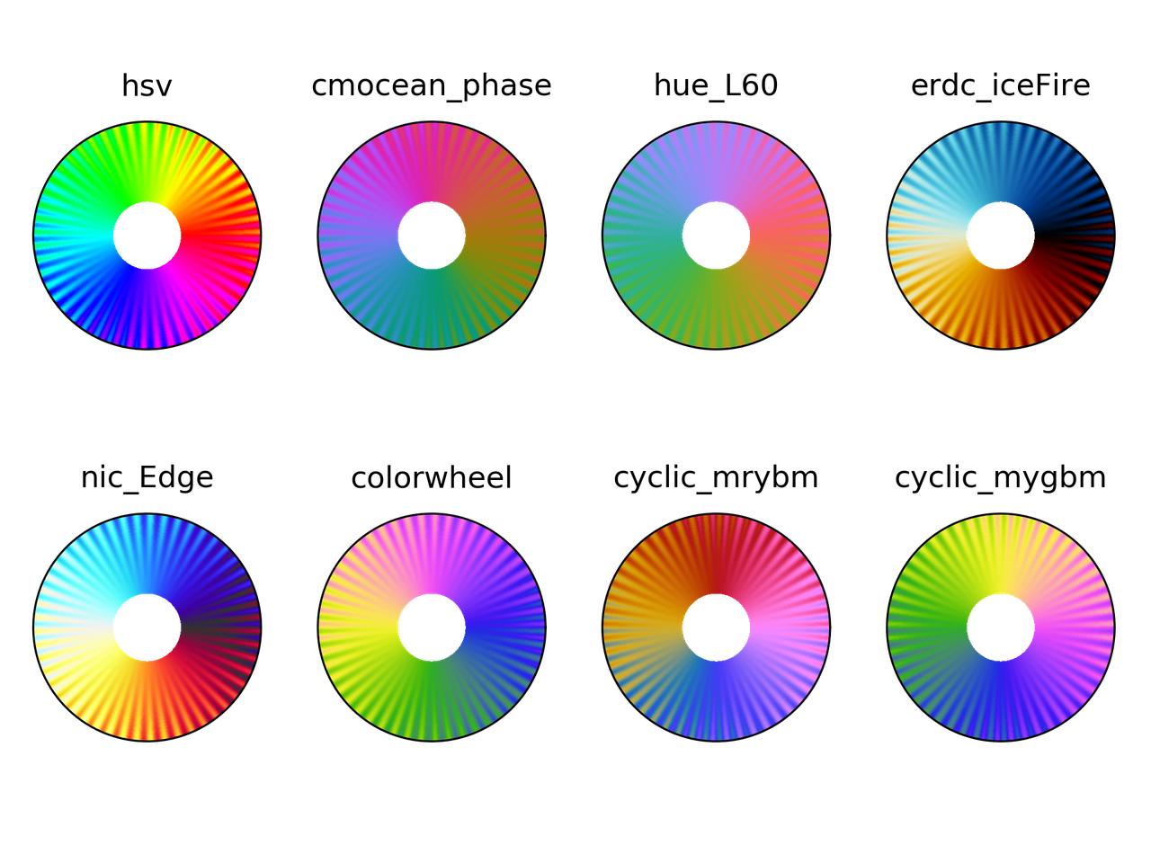
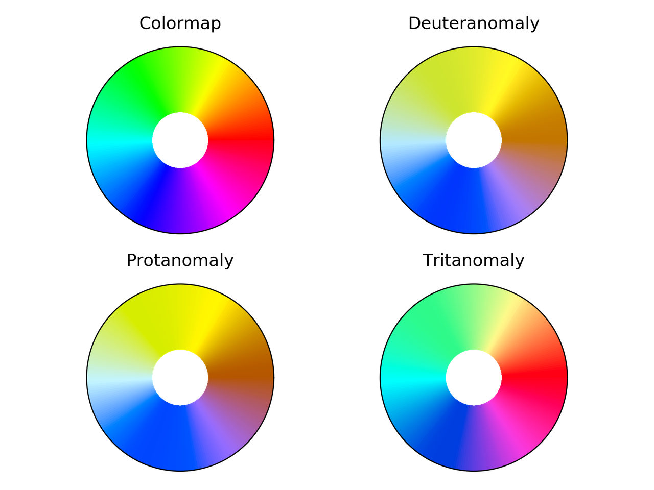
but the colormap used is Spectral, that is divergent. This made me think about using a cyclic colormap, and ended up in this StackOverflow question. And I decided to compare some cyclic colormaps.

I picked up colormaps from different sources

  • cmocean:

    • phase

  • Paraview:

    • hue_L60

    • erdc_iceFire

    • nic_Edge

  • Colorcet:

    • colorwheel

    • cyclic_mrybm_35_75_c68

    • cyclic_mygbm_30_95_c78

and, of course, hsv. You can download the colormaps in text format from here.

Comparison

For all the examples below the following imports are done:

from __future__ import division, print_function
import numpy as np
import matplotlib.pyplot as plt
from matplotlib.colors import LinearSegmentedColormap
from colorspacious import cspace_convert

Color map test image

Peter Kovesi proposed a way to compare cyclic colormaps on a paper on 2015. It consists of a spiral ramp with an undulation. In polar coordinates it reads

\begin{equation*} c = (A \rho^p \sin(n \theta) + \theta)\, \mathrm{mod}\, 2\pi \end{equation*}

with \(A\) the amplitude of the oscilation, \(\rho\) the normalized radius in [0, 1], \(p\) a positive number, and \(n\) the number of cycles.

And the following function creates the grid in Python

def circle_sine_ramp(r_max=1, r_min=0.3, amp=np.pi/5, cycles=50,
                     power=2, nr=50, ntheta=1025):
r, t = np.mgrid[r_min:r_max:nr*1j, 0:2*np.pi:ntheta*1j]
r_norm = (r - r_min)/(r_max - r_min)
vals = amp * r_norm**power * np.sin(cycles*t) + t
vals = np.mod(vals, 2*np.pi)
return t, r, vals

The following is the result

/images/sine_helix_cyclic_cmap.png

Colorblindness test

t, r, vals = circle_sine_ramp(cycles=0)
cmaps = ["hsv",
         "cmocean_phase",
         "hue_L60",
         "erdc_iceFire",
         "nic_Edge",
         "colorwheel",
         "cyclic_mrybm",
         "cyclic_mygbm"]
severity = [0, 50, 50, 50]
for colormap in cmaps:
    data = np.loadtxt(colormap + ".txt")
    fig = plt.figure()
    for cont in range(4):
        cvd_space = {"name": "sRGB1+CVD",
             "cvd_type": cvd_type[cont],
             "severity": severity[cont]}
        data2 = cspace_convert(data, cvd_space, "sRGB1")
        data2 = np.clip(data2, 0, 1)
        cmap = LinearSegmentedColormap.from_list('my_colormap', data2)
        ax = plt.subplot(2, 2, 1 + cont, projection="polar")
        ax.pcolormesh(t, r, vals, cmap=cmap)
        ax.set_xticks([])
        ax.set_yticks([])
    plt.suptitle(colormap)
    plt.tight_layout()
    plt.savefig(colormap + ".png", dpi=300)
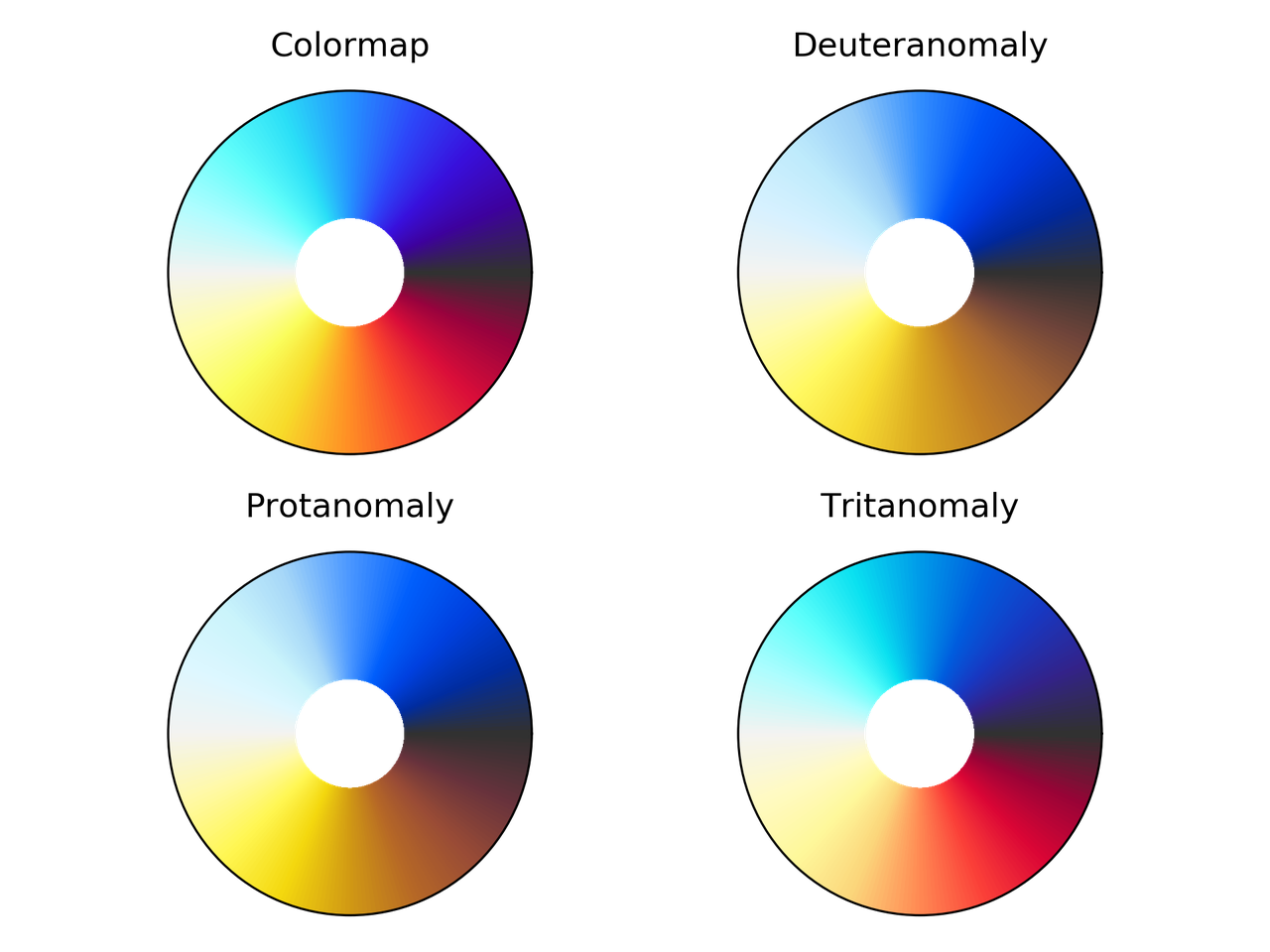
/images/hsv_eval.png

hsv colormap comparison for different color vision deficiencies.

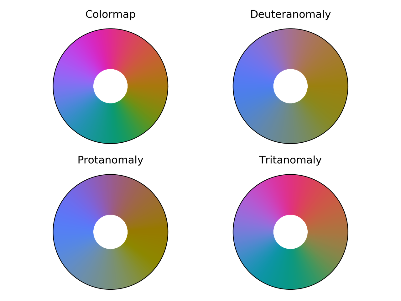
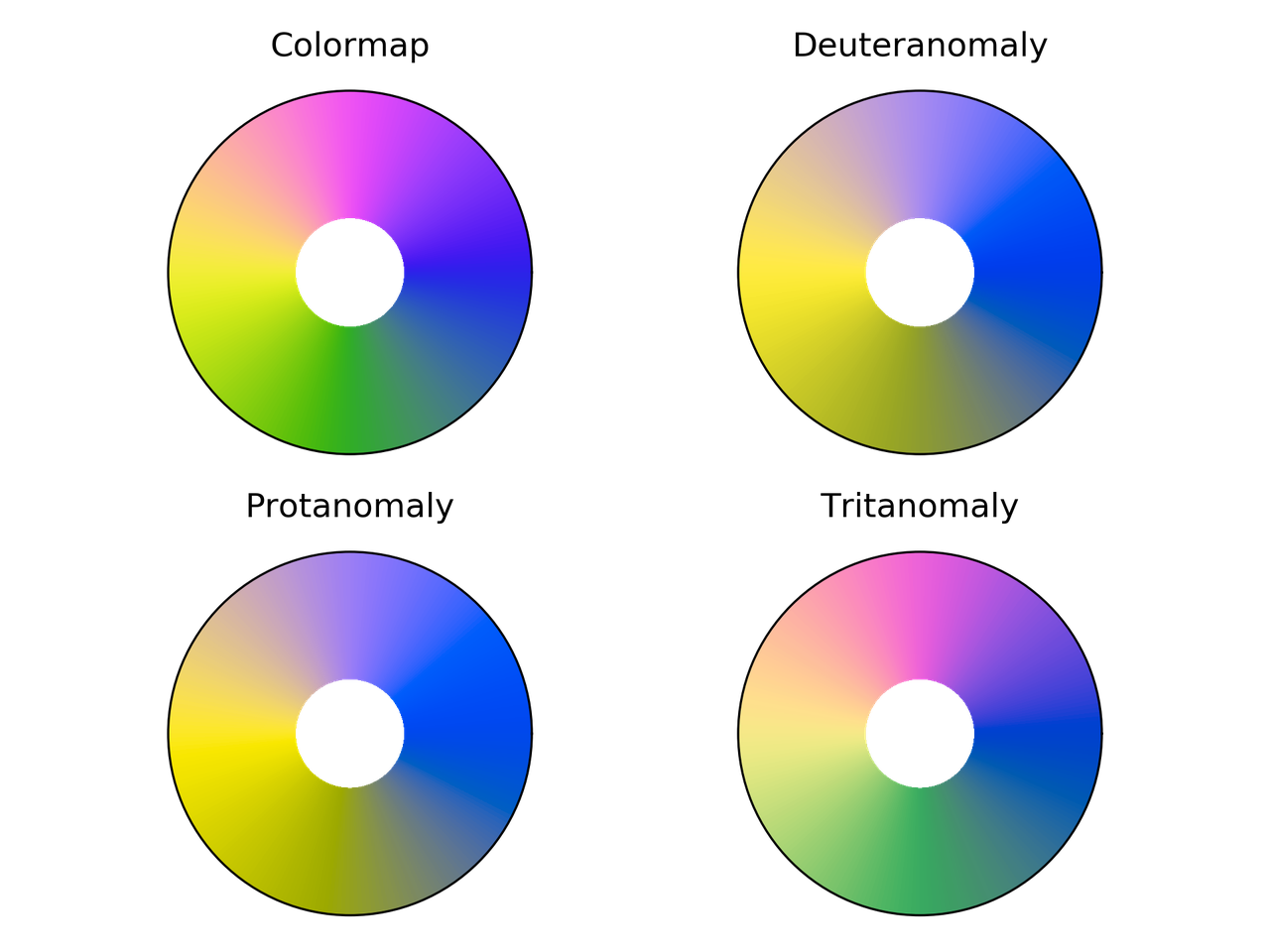
/images/cmocean_phase_eval.png

Phase colormap comparison for different color vision deficiencies.

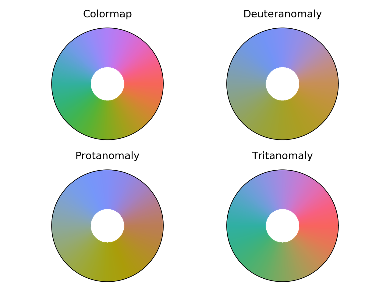
/images/hue_L60_eval.png

hue_L60 colormap comparison for different color vision deficiencies.

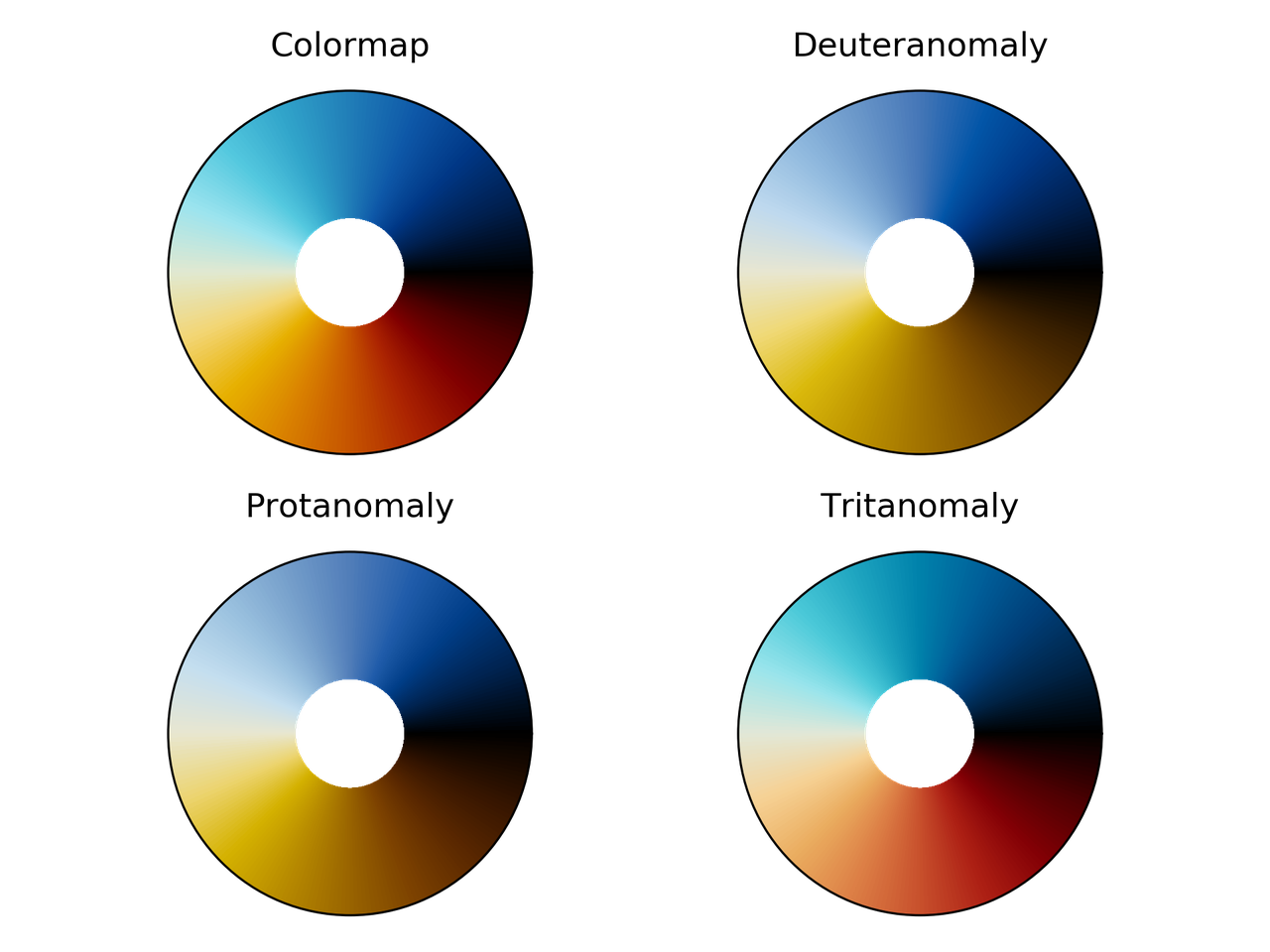
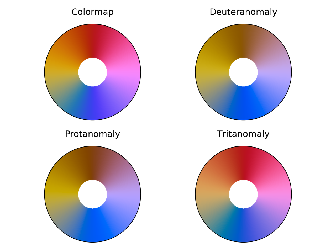
/images/erdc_iceFire_eval.png

erdc_iceFire colormap comparison for different color vision deficiencies.

/images/nic_Edge_eval.png

nic_Edge colormap comparison for different color vision deficiencies.

/images/colorwheel_eval.png

Colorwheel colormap comparison for different color vision deficiencies.

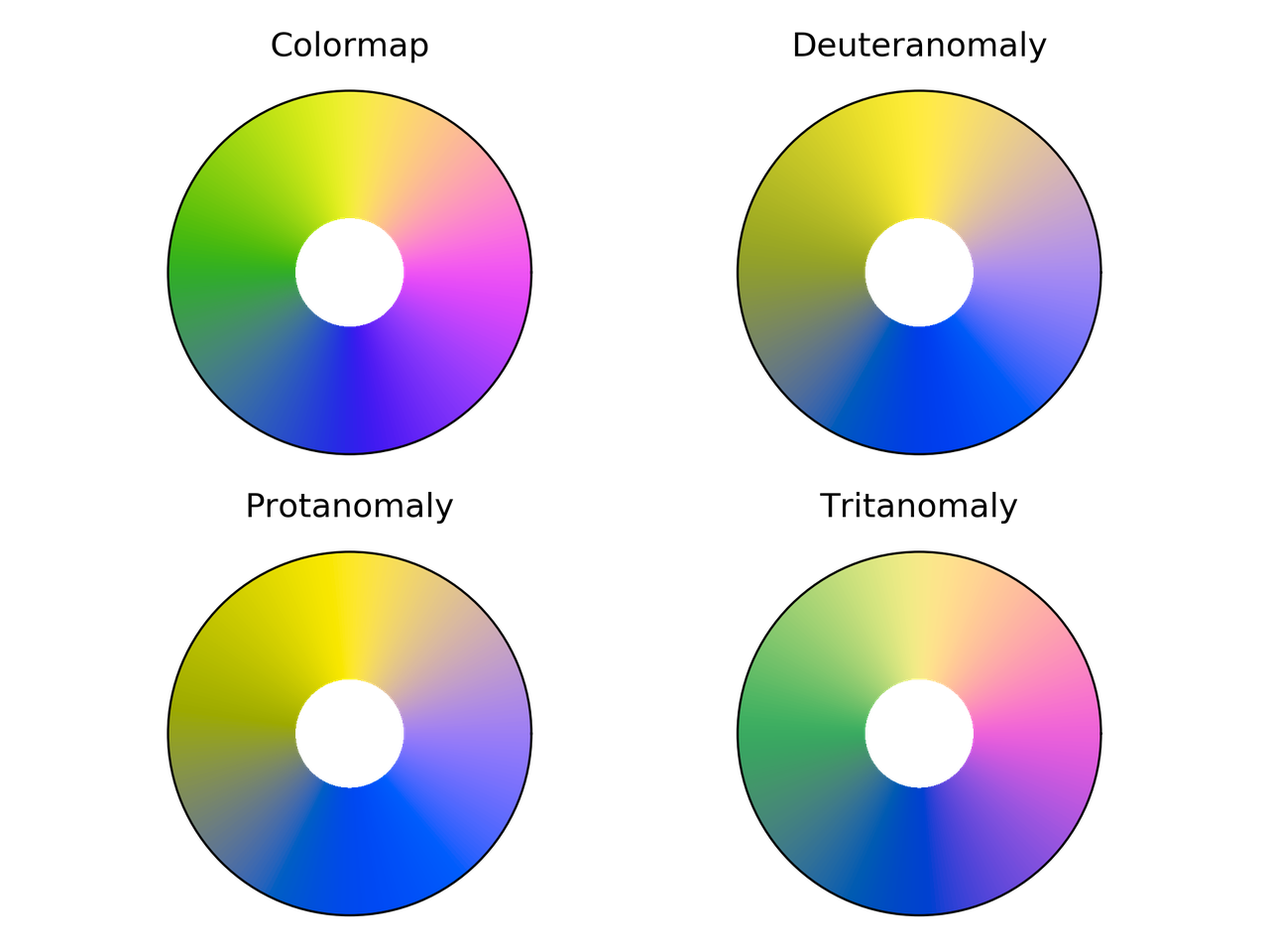
/images/cyclic_mrybm_eval.png

Cyclic_mrybm colormap comparison for different color vision deficiencies.

/images/cyclic_mygbm_eval.png

Cyclic_mygbm colormap comparison for different color vision deficiencies.

Randomly generated cyclic colormaps

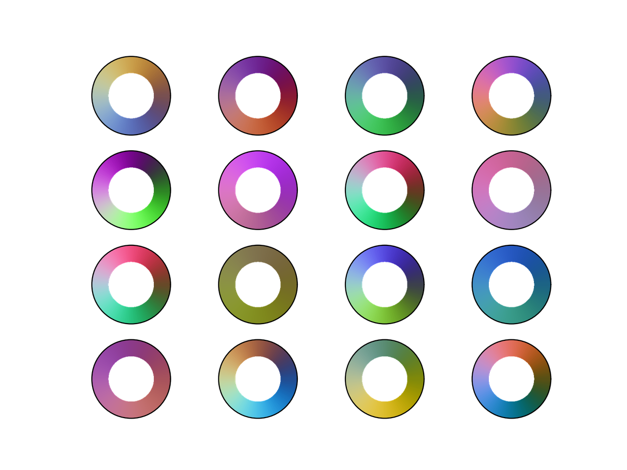
What if we generate some random colormaps that are cyclic? How would they look like?

Following are the snippet and resulting colormaps.

from __future__ import division, print_function
import numpy as np
from mpl_toolkits.mplot3d import Axes3D
import matplotlib.pyplot as plt
from matplotlib.colors import LinearSegmentedColormap


# Next line to silence pyflakes. This import is needed.
Axes3D

plt.close("all")
fig = plt.figure()
fig2 = plt.figure()
nx = 4
ny = 4
azimuths = np.arange(0, 361, 1)
zeniths = np.arange(30, 70, 1)
values = azimuths * np.ones((30, 361))
for cont in range(nx * ny):
    np.random.seed(seed=cont)
    rad = np.random.uniform(0.1, 0.5)
    center = np.random.uniform(rad, 1 - rad, size=(3, 1))
    mat = np.random.rand(3, 3)
    rot_mat, _ = np.linalg.qr(mat)
    t = np.linspace(0, 2*np.pi, 256)
    x = rad*np.cos(t)
    y = rad*np.sin(t)
    z = 0.0*np.cos(t)
    X = np.vstack((x, y, z))
    X = rot_mat.dot(X) + center

    ax = fig.add_subplot(ny, nx, 1 + cont, projection='polar')
    cmap = LinearSegmentedColormap.from_list('my_colormap', X.T)
    ax.pcolormesh(azimuths*np.pi/180.0, zeniths, values, cmap=cmap)
    ax.set_xticks([])
    ax.set_yticks([])

    ax2 = fig2.add_subplot(ny, nx, 1 + cont, projection='3d')
    ax2.plot(X[0, :], X[1, :], X[2, :])
    ax2.set_xlim(0, 1)
    ax2.set_ylim(0, 1)
    ax2.set_zlim(0, 1)
    ax2.view_init(30, -60)
    ax2.set_xticks([0, 0.5, 1.0])
    ax2.set_yticks([0, 0.5, 1.0])
    ax2.set_zticks([0, 0.5, 1.0])
    ax2.set_xticklabels([])
    ax2.set_yticklabels([])
    ax2.set_zticklabels([])


fig.savefig("random_cmaps.png", dpi=300, transparent=True)
fig2.savefig("random_cmaps_traj.svg", transparent=True)
/images/random_cmaps.png

16 randomly generated colormaps.

/images/random_cmaps_traj.svg

Trajectories in RGB space for the randomly generated colormaps.

A good idea would be to take these colormaps and optimize some perceptual parameters such as lightness to get some usable ones.

Conclusions

I probably would use phase, colorwheel, or mrybm in the future.

/images/toroidal_helix_phase.svg

Initial image using phase.

/images/toroidal_helix_colorwheel.svg

Initial image using colorwheel.

/images/toroidal_helix_mrybm.svg

Initial image using mrybm.

References

  1. Peter Kovesi. Good Colour Maps: How to Design Them. arXiv:1509.03700 [cs.GR] 2015

Probability that a random tetrahedron over a sphere contains its center

I got interested in this problem watching the YouTube channel 3Blue1Brown, by Grant Sanderson, where he explains a way to tackle the problem that is just … elegant!

I can't emphasize enough how much I like this channel. For example, his approach to linear algebra in Essence of linear algebra is really good. I mention it, just in case you don't know it.

The problem

Let's talk business now. The problem was originally part of the 53rd Putnam competition on 1992 and was stated as

Four points are chosen at random on the surface of a sphere. What is the probability that the center of the sphere lies inside the tetrahedron whose vertices are at the four points? (It is understood that each point is in- dependently chosen relative to a uniform distribution on the sphere.)

As shown in the mentioned video, the probability is \(1/8\). Let's come with an algorithm to obtain this result —approximately, at least.

The proposed approach

The approach that we are going to use is pretty straightforward. We are going to obtain a sample of (independent) random sets, with four points each, and check how many of them satisfy the condition of being inside the tetrahedron with the points as vertices.

For this approach to work, we need two things:

  1. A way to generate random numbers uniformly distributed. This is already in numpy.random.uniform, so we don't need to do much about it.

  2. A way to check if a point is inside a tetrahedron.

Checking that a point is inside a tetrahedron

To find if a point is inside a tetrahedron, we could compute the barycentric coordinates for that point and check that all of them are have the same sign. Equivalently, as proposed here, we can check that the determinants of the matrices

\begin{equation*} M_0 = \begin{bmatrix} x_0 &y_0 &z_0 &1\\ x_1 &y_1 &z_1 &1\\ x_2 &y_2 &z_2 &1\\ x_3 &y_3 &z_3 &1 \end{bmatrix}\, , \end{equation*}
\begin{equation*} M_1 = \begin{bmatrix} x &y &z &1\\ x_1 &y_1 &z_1 &1\\ x_2 &y_2 &z_2 &1\\ x_3 &y_3 &z_3 &1 \end{bmatrix}\, , \end{equation*}
\begin{equation*} M_2 = \begin{bmatrix} x_0 &y_0 &z_0 &1\\ x &y &z &1\\ x_2 &y_2 &z_2 &1\\ x_3 &y_3 &z_3 &1 \end{bmatrix}\, , \end{equation*}
\begin{equation*} M_3 = \begin{bmatrix} x_0 &y_0 &z_0 &1\\ x_1 &y_1 &z_1 &1\\ x &y &z &1\\ x_3 &y_3 &z_3 &1 \end{bmatrix}\, , \end{equation*}
\begin{equation*} M_4 = \begin{bmatrix} x_0 &y_0 &z_0 &1\\ x_1 &y_1 &z_1 &1\\ x_2 &y_2 &z_2 &1\\ x &y &z &1 \end{bmatrix}\, , \end{equation*}

have the same sign. In this case, \((x, y, z)\) is the point of interest and \((x_i, y_i, z_i)\) are the coordinates of each vertex.

The algorithm

Below is a Python implementation of the approach discussed before

from __future__ import division, print_function
from numpy import (random, pi, cos, sin, sign, hstack,
                   column_stack, logspace)
from numpy.linalg import det
import matplotlib.pyplot as plt


def in_tet(x, y, z, pt):
    """
    Determine if the point pt is inside the
    tetrahedron with vertices coordinates x, y, z
    """
    mat0 = column_stack((x, y, z, [1, 1, 1, 1]))
    det0 = det(mat0)
    for cont in range(4):
        mat = mat0.copy()
        mat[cont] = hstack((pt, 1))
        if sign(det(mat)*det0) < 0:
            inside = False
            break
        else:
            inside = True
    return inside


#%% Computation
prob = []
random.seed(seed=2)
N_min = 1
N_max = 5
N_vals = logspace(N_min, N_max, 100, dtype=int)
for N in N_vals:
    inside_cont = 0
    for cont_pts in range(N):
        phi = random.uniform(low=0.0, high=2*pi, size=4)
        theta = random.uniform(low=0.0, high=pi, size=4)
        x = sin(theta)*cos(phi)
        y = sin(theta)*sin(phi)
        z = cos(theta)
        if in_tet(x, y, z, [0, 0, 0]):
            inside_cont += 1

    prob.append(inside_cont/N)


#%% Plotting
plt.figure(figsize=(4, 3))
plt.hlines(0.125, 10**N_min, 10**N_max, color="#3f3f3f")
plt.semilogx(N_vals, prob, "o", alpha=0.5)
plt.xlabel("Number of trials")
plt.ylabel("Computed probability")
plt.tight_layout()
plt.show()

As expected, when the number of samples is sufficiently large, the estimated probability is close to the theoretical value: 0.125. This can be seen in the following figure.

Computed probability for different sample sizes