Duplicating Hankel plot from Abramowitz & Stegun
Recently, I had a discussion in class about solutions for partial differential equations and how visualization played a role way before digital computers were ubiquitous. We also discussed about the Handbook of Mathematical Functions or Abramowitz and Stegun [1] , as it is commonly called.
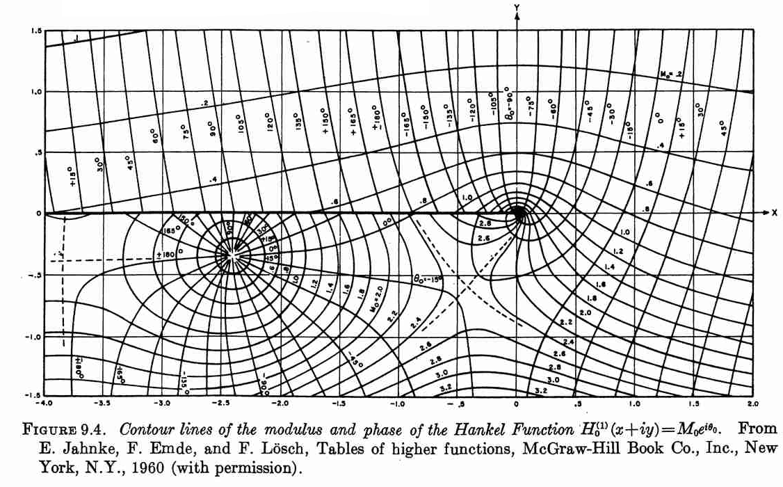
Luckily, John D. Cook replicated the following plot from Abramowitz and Stegun in his blog using Mathematica. Although, this figure was originally published in [2].
So, I tried to replicate this figure using Matplotlib.
The following plot is the result of using the contour function on
the modulus and phase of the Hankel function.

This was obtained with the following code.
import numpy as np
import matplotlib.pyplot as plt
from scipy.special import hankel1

y, x = np.mgrid[-1.5:1.5:2500j, -4:2:5000j]
z = x + 1j*y
H = hankel1(0, z)
abs_H = np.abs(H)
arg_H = np.rad2deg(np.angle(H))

fig, ax = plt.subplots(figsize=(12, 6))

plt.contour(x, y, abs_H, 20, colors="black")
plt.contour(x, y, arg_H, 30, colors="#757575")


plt.xticks(np.arange(-4, 2.5, 0.5))
plt.yticks(np.arange(-1.5, 2, 0.5))

plt.xlabel("Real axis")
plt.ylabel("Imaginary axis")

plt.grid("True")
plt.axis("image")
plt.savefig("abramowitz_stegun-hankel-0.svg", bbox_inches="tight")
plt.show()
There are some problems with the jump across the negative part of the real line. We can apply a mask with the following code:
Also, we have some problems around ±180° that correspond to the same phase value but the contour algorithm fails—maybe there is a variant of marching squares that allow to work with periodic data. To solve this issue I did the following, trick:
And we obtain the following figure.

We are missing the labels that show us the value of some of the contours. If we do it automatically, we obtain the following figure.

To obtain a figure closer to the original, Matplotlib has an
optional parameter
called manual that allows the user to place the labels of the contours
manually.
The following figure is closer to the original.

The following snippet presents the code for the final version. You can download it here
import numpy as np
import matplotlib.pyplot as plt
from scipy.special import hankel1


#%% Data
y, x = np.mgrid[-1.5:1.5:2500j, -4:2:5000j]
z = x + 1j*y
H = hankel1(0, z)

abs_H = np.abs(H)
abs_H[(x < 0) *  (np.abs(y) < 0.01)] = np.nan
levels_abs = np.arange(0.2, 3.3, 0.2)


arg_H = np.rad2deg(np.angle(H))
arg_H[(x < 0) *  (np.abs(y) < 0.01)] = np.nan
arg_H[arg_H < -179] += 360
arg_H[arg_H < -178] = np.nan
levels_arg = np.arange(-165, 181, 15)


#%% Plots setup
labels = True
manual_labels = True


#%% Ploting
fig, ax = plt.subplots(figsize=(12, 6))

# Jump line
plt.plot([-4, 0], [0, 0], color="black", linewidth=3, zorder=3)

# Contours
abs_contours = plt.contour(x, y, abs_H, levels_abs, colors="black",
                            linestyles="solid", zorder=4)
arg_contours = plt.contour(x, y, arg_H, levels_arg, colors="#757575",
                            linestyles="solid", zorder=6)

# Figure details
plt.xticks(np.arange(-4, 2.5, 0.5))
plt.yticks(np.arange(-1.5, 2, 0.5))

plt.xlabel("Real axis")
plt.ylabel("Imaginary axis")

plt.grid("True", color="#BDBDBD", zorder=3)
plt.axis("image")

# Labels
if labels:
    ax.clabel(abs_contours, levels_abs, fontsize=8, fmt="%.1f",
            use_clabeltext=True, manual=manual_labels, zorder=5)
    ax.clabel(arg_contours, levels_arg, fontsize=8, fmt="%d°",
            colors="#757575",
            use_clabeltext=True, manual=manual_labels, zorder=6)

plt.savefig("abramowitz_stegun-hankel-manual.svg", bbox_inches="tight")
plt.show()
Comments
Comments powered by Disqus